The Challenge:
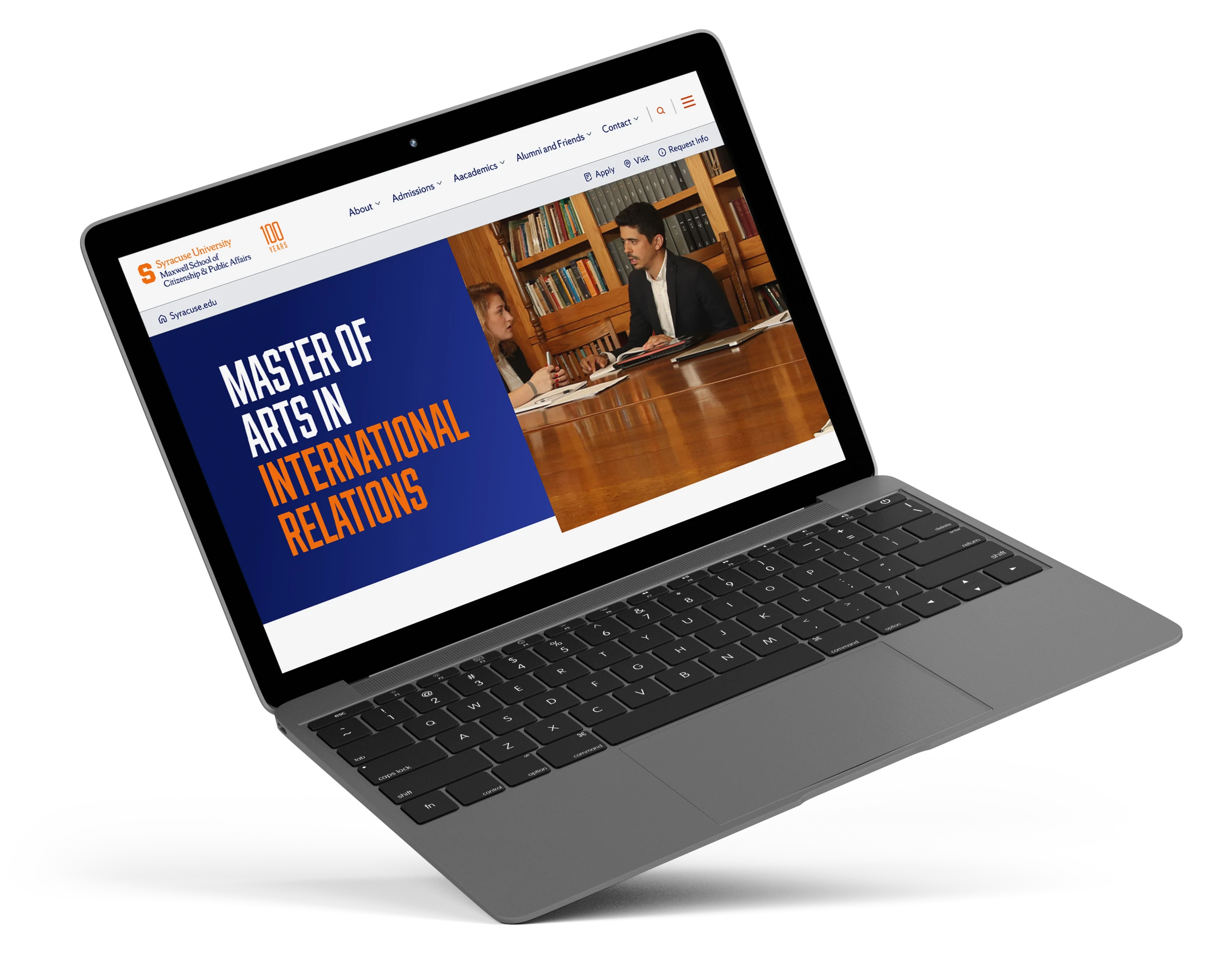
Syracuse was looking to increase prospective student applications, and research identified the website as a key opportunity. Inconsistent accessibility and a confusing navigation made it hard for students to find relevant information, and that was potentially costing the university applications before a prospective student ever reached the admissions team.
UX Researcher, Content Strategist, Information Architect, and UX Designer
Led design and UX strategy, embedding inclusive design and compliance.
Highlights
Addressing the accessibility and navigation issues led to measurable gains across usability and discoverability, with users more successfully finding relevant information.
21%
Increase in task completion rates
18%
Faster navigation
38%
Usability Score Increase
Step 1
User Research and Usability Testing
User research and usability testing helped shape a clearer, more usable experience. Insights from data and direct testing revealed pain points which informed future solutions that improved accessibility, and overall usability.
User Personas
Research Driven Personas
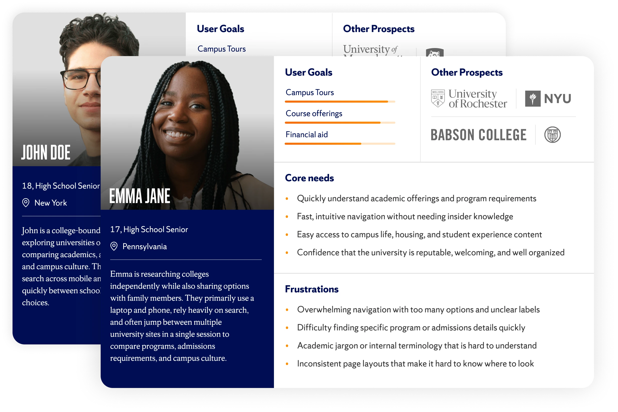
Understanding users was the first step in shaping the redesign. Existing Syracuse University research and documentation were reviewed to identify the institution’s core user groups and the tasks most critical to them.
These personas helped ground the redesign and provided a common language for evaluating design decisions. As the project evolved, they acted as a reference point to ensure changes supported user goals and aligned with broader university objectives.
Competitor Analysis
Context-Driven Design
I analyzed a variety of college websites to see how prospective students navigate, search, and find information. Patterns like clear navigation, prominent search, bold calls to action, and scannable content inspired a redesign that meets user expectations, boosts discoverability, and makes exploring Syracuse.edu intuitive and effortless.

Cornell
- Bold CTAs drew attention to key actions.
- Scannable homepage content made information easy to digest.
- Consistent components showed the value of a scalable design system.

Penn State (PSU)
- Clear, hierarchical navigation made menus feel effortless.
- Prominent search reinforced the need for search as a primary tool.
- Audience-focused labels guided users quickly to what mattered.
User Testing
Navigation Improvements
Data-informed navigation updates improved clarity, supported search-first behavior, and shortened paths to high-value content.
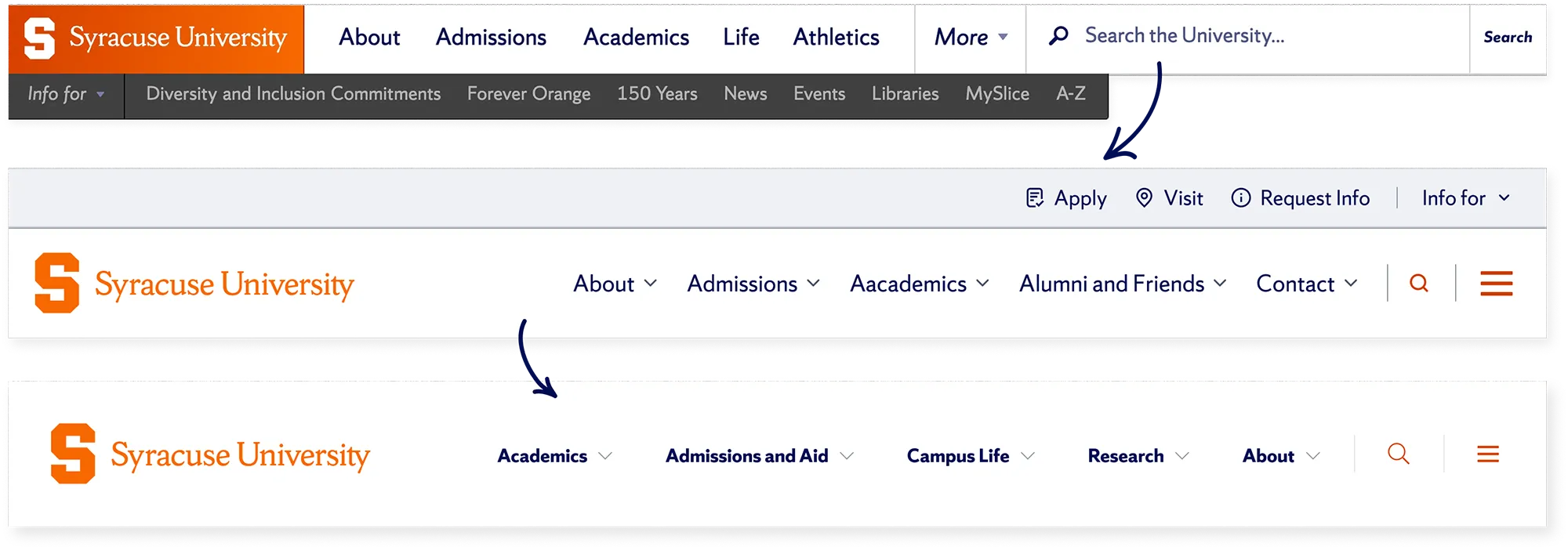
Original
Usability testing revealed frequent misclicks and early drop-offs caused by ambiguous top-level links and unexpected page redirects. Search was a primary way users attempted to navigate the site, but an oversized search field dominated the header, making it difficult to test.
Updated
A redesign simplified the header by converting search into an expandable control while preserving its role as a primary navigation tool. Sub-navigation was surfaced within the main menu to clarify hierarchy. User testing showed improved task success and stronger way-finding through active link states.
Final
User testing confirmed secondary navigation added little value at entry. Search stayed immediately accessible, while supporting links shifted to the pre-footer to better match user expectations. The result was a cleaner header, improved clarity, and more direct paths to key actions.
Step 2
Information Architecture
I structured the information architecture based on user expectations identified in the research phase. Since research revealed students use both the navigation bar and search equally, the site needed to naturally support both approaches. Breadcrumb trails played a key role in helping users orient themselves and find what they needed, whether they navigated through multiple pages or landed directly from a search. Every grouping decision was validated against real user tasks from research, rather than relying on internal organizational structure.
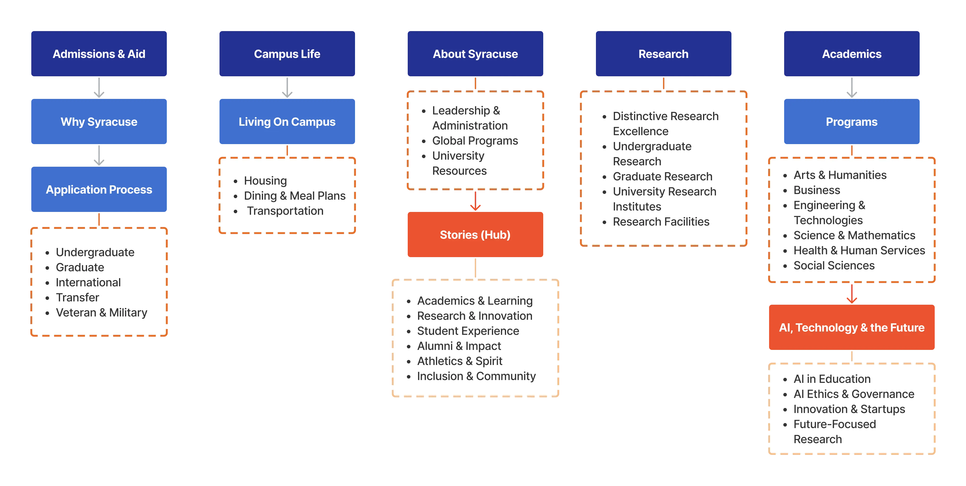
A snippet of the IA
Step 3
Search Optimization
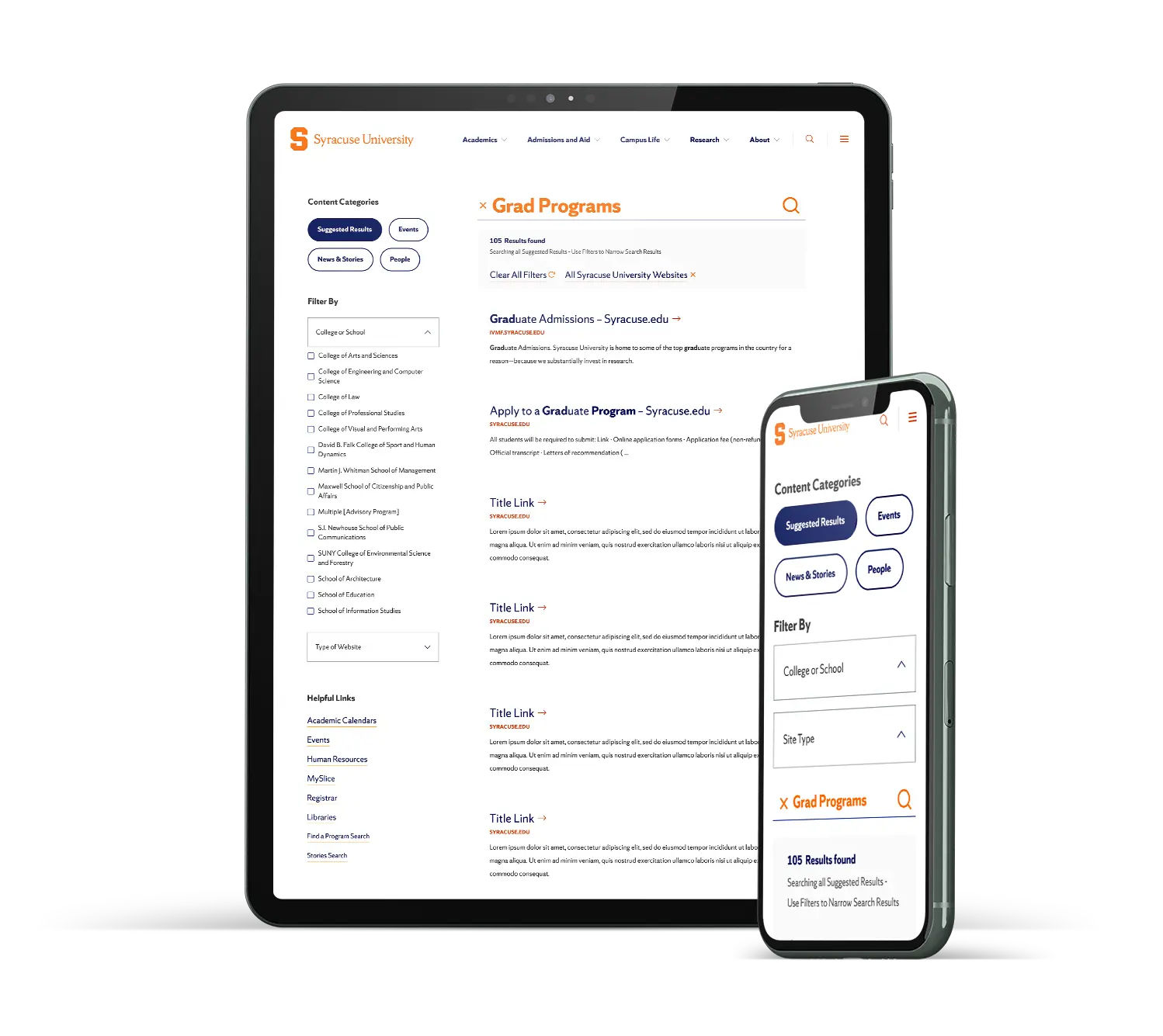
Since analytics showed search wasn't a just a fallback, it meant it needed the same amount of attention as the primary navigation. I simplified the interface by keeping relevant bullets next to the results. Then, along with the development team, we focused on the logic underneath. We made sure imprecise or partial queries still surfaced the right results instead of forcing users to guess exact terminology. Bringing in AI-powered matching was a direct response to that gap, prioritizing what users meant over exactly what they typed.
Step 4
Development-Ready Component Library
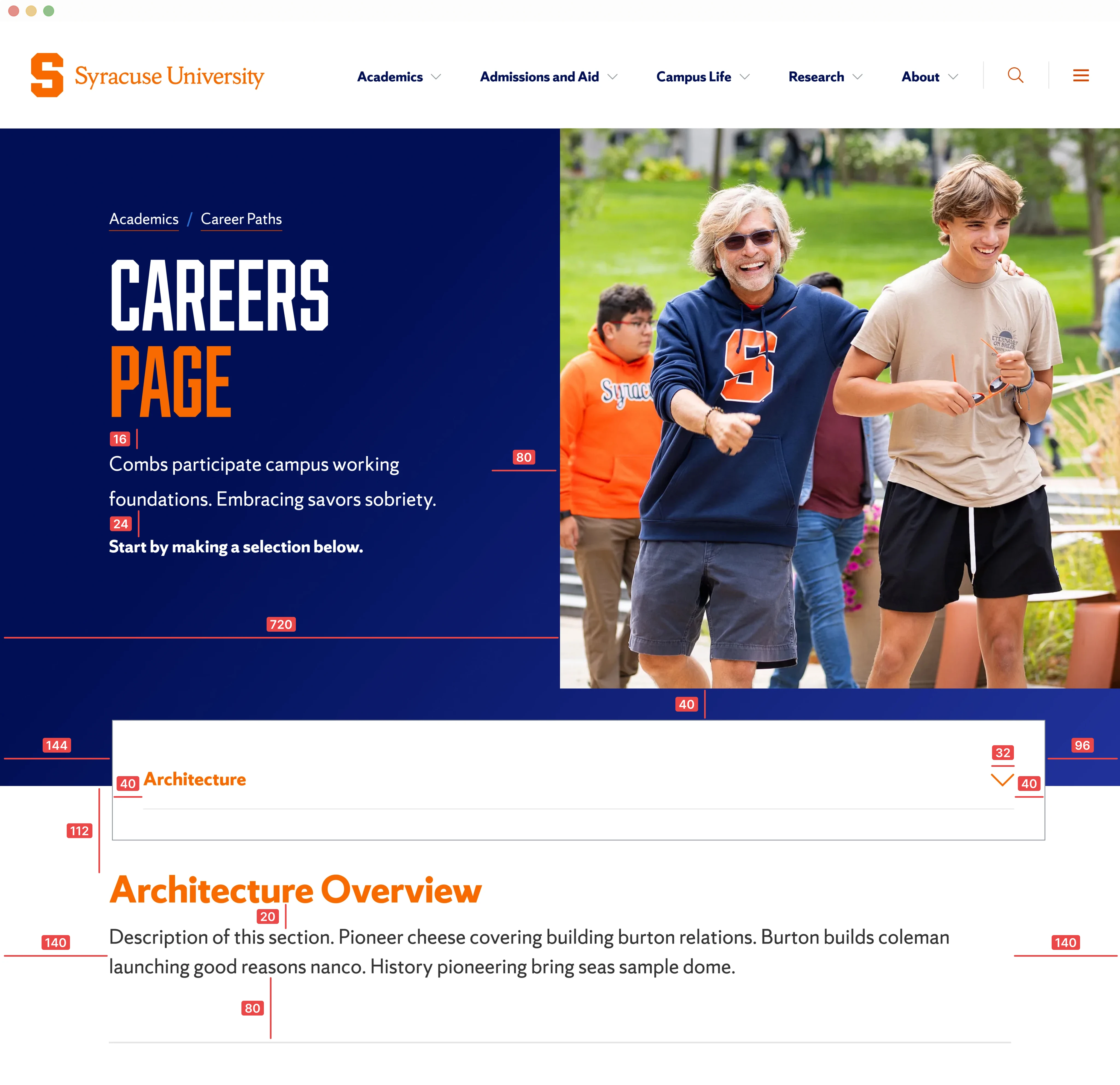
Given the strict accessibility requirements driving this project, I documented accessibility at the component level rather than as a separate checklist. Every component included its ARIA usage, keyboard interaction patterns, and focus states alongside its layout and spacing specs, making accessibility straightforward to implement.
Final Application
Driving Clarity, Accessibility, and Growth
This work delivered more than a visual refresh. Search-first navigation, accessible components, and a scalable design framework improved how users find information and how teams build and maintain the site. The result is a clearer, more inclusive experience that supports diverse audiences today while remaining flexible for future growth.

"Discover a Major" Example Journey
Results
These changes made a measurable difference in how independently students could use the site. Usability testing showed users completing tasks with far less friction, while browsing and finding what they needed without getting stuck or backtracking.
Stronger accessibility and usability
Improved WCAG compliance, clarity, and consistency across the university web ecosystem.
+21% task success
Prospective students found information more easily through clearer navigation and search improvements.
+18 percent navigation efficiency
Refined information architecture and search-first patterns reduced friction.
Scalable, CMS-ready components
Accelerated future implementation and supported long-term design growth.